
Describing Graphs and charts
1. This is the results of Swadhin in his Term-End exam. Now, describe the chart in 120 words.
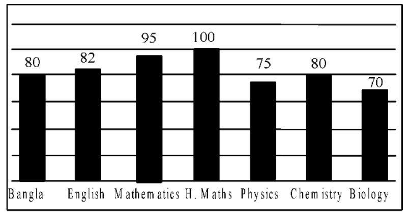
Answer: The graph above shows the results of Swadhin in his Term-end exam. According to the data, it is clear that Swadhin is a student of the science group. He obtained full marks in H. Maths. He got 100 out of 100. This is his highest mark in his Term-End exam. He got the lowest mark in Biology. The mark is 70. Then he gathered 75 in Physics. He got the third lowest marks, 80 in both Bangla and Chemistry. Then, we find a steady progression in his Term-End result. He got 82 in English. In Mathematics he scored 95, the second highest marks. On average, he got about 83% marks. The result shows that Swadhin is a brilliant student.
আরো পড়ুন : Unit-7, Lesson-6 (B)-এর ২টি প্রশ্নোত্তর, ১ম পর্ব
2. Look at the chart below. Try to describe/ analyze the chart in your own words. The horizontal numbers are based on million (approximate). The vertical numbers are for years. On the basis of the chart below, write a comparative article on mobile users, non mobile users and internet users.
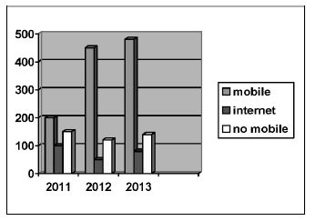
Answer: The graph above shows a comparative data of mobile users, non mobile users and internet users. The data indicates the increase in the number of mobile and internet users from the year 2011 to 2013. At the same time, we find a gradual decrease in the number of non mobile users from 2011-2013. In 2011, the number of mobile phone users exceeded 200 million and the non mobile users were below 200 million. About 50 million people used the internet then. The numbers increased to 75 million in 2012. That year, the number of mobile phone users progressed steadily to below 400 million. As the number of mobile phone users increased, logically the number of non mobile users decreased to 125 million. In 2013, the number of non mobile users decreased to 100 million leading the number of mobile users to a little less than 500 million. That year, the number of internet users increased to less than 100 million. The data proves that the world is getting technologically advanced day by day and people are leaning towards current telecommunication systems.
3. The graph below shows 'Literacy Rate' from 1995 to 2010. Describe the graph in 150 words. You should highlight and summarize the information given in the graph.
Literacy rate (%)
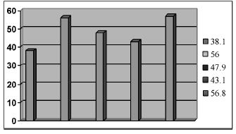
Answer: The above bar shows the literacy rate from 1995 to 2010. In the year 1995, the literacy rate was only 38.1%. After five years in 2000, we can notice a rapid growth of the literacy rate. The literacy rate reached 56% this year. After one year in 2001, there was a downfall in the literacy rate. The literacy rate decreased to 47.9% this year. After two years in 2003, the literacy rate again decreased to 43.1%. Seven years later in 2010, we found a sharp rise in the literacy rate. The literacy rate increased to 56.8%.
লেখক : প্রভাষক
বীরশ্রেষ্ঠ মুন্সি আব্দুর রউফ পাবলিক কলেজ, ঢাকা
কবীর


